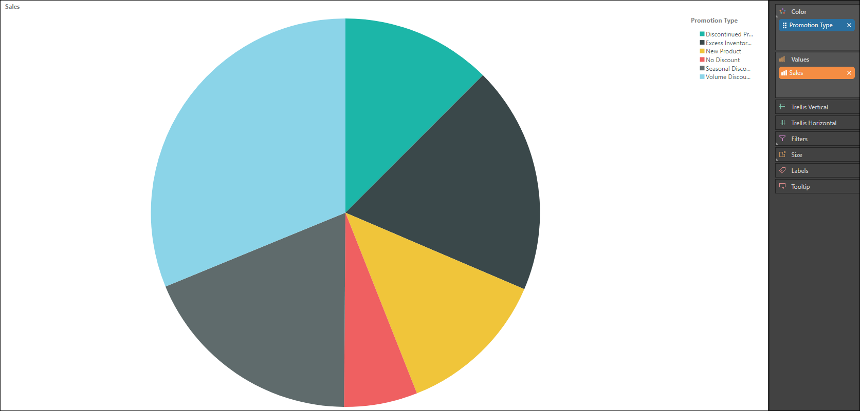
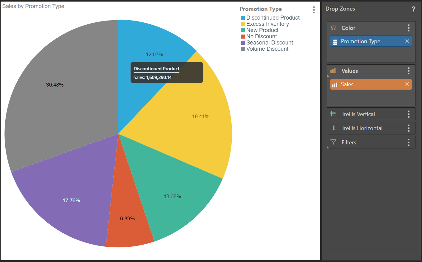
Pie charts are a good way to visualize percentage or proportional data when you're comparing only a few elements. The pie chart represents the given member hierarchy as colored segments of a whole; the segment color is driven by the member hierarchy, while the segment size is driven by the measure.
Build a Pie Chart
Step 1
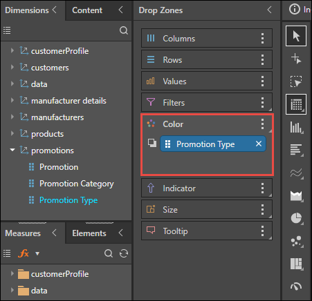
Add the required member hierarchy to the Color drop zone (red highlight below).
Step 2
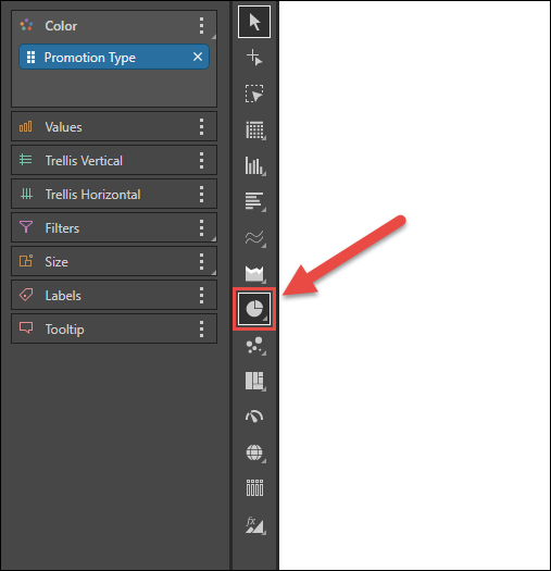
Select Pie Chart from the visualization menu.
Step 3
Add the required measure (sales) to the Values zone.
Step 4
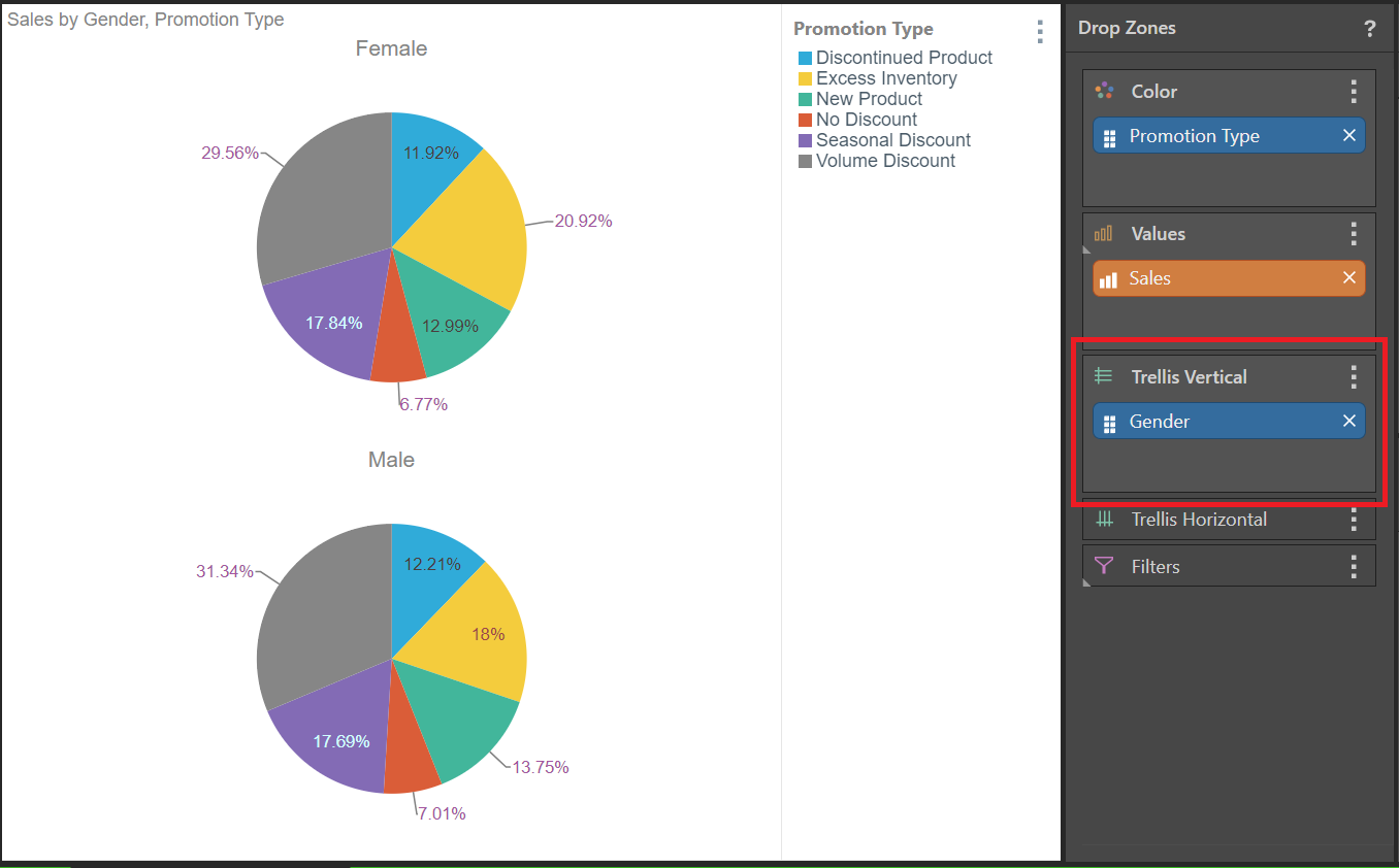
Split the visual into two trellised pie charts, where the sales data is split by gender. You can do this either by dragging Gender from the Dimension tree into the Trellis Vertical or Trellis Horizontal drop zones, or you can use the Chatbot to "add gender."
In either case, the visual is trellised, creating two individual pies that break down the sales by promotion type with reference to the gender of the customer.